Portfolio: The Evergreen State College
Six years after I was initially hired to redesign Evergreen’s website, I had the opportunity to do it all over again.
This project posed special challenges, because even knowing my own design could stand an update, it was hard to figure out exactly how to improve on it without it becoming a poorly stitched together hybrid of two designs. The experience gave me the chance to make small tweaks and fixes in some areas, and dramatic changes in others. Ultimately, I believe I came up with something that references established patterns, but that stylistically stands on its own.
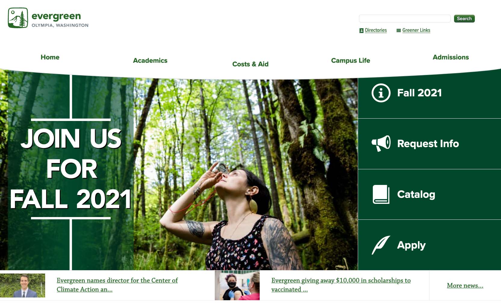
Most of our team’s web work was focused on our primary audience: prospective students.
We already had a good understanding of the way people used the website because nearly every month we ran in-person usability studies to observe how it was working with real tasks, so luckily it wasn’t necessary to make dramatic overhaul of the user experience.
Doubling Down on Mobile
I determined that the major area in need of change was better support for mobile devices. I had designed our previous website to be responsive and mobile friendly, but over the years the mobile landscape had shifted dramatically enough that I wanted to reset baseline expectations and double down on serving that audience as best we could. In studying the mobile experience, I determined that the biggest change we needed to make wasn’t a matter of functionality, but rather perspective. We didn’t necessarily need to make the site itself work better, we needed the people behind the site to make better choices in how they presented their content.
We didn’t need to make the site itself work better, we needed the people behind the site to make better choices.
Here’s what I mean. In the previous iteration of the design, we had two content areas: one for primary content and one for secondary content. On a mobile device, the secondary content would appear under the primary content—that should make sense. On a wider desktop display, the secondary content would float up to become a second column. After all, more screen real estate means there’s more room for more columns.
However, the people who owned those pages almost exclusively looked at them on their work computers—with desktop displays. They weren’t naturally inclined to think about how that might work for other users, mobile users. When there are two columns side-by-side, the tops of those columns have a relatively equal importance. These content owners were putting important calls-to-action at the top of the secondary column. But when mobile users visited from their phones, those important buttons would be pushed way down the page, under all the primary content.
In my redesign, I solved that problem by forcing the secondary content down below the primary content, even on desktop devices, and I broke it up into three equal columns. This made it blatantly apparent to content owners that if they wanted people to take an action, they would have to put that call in the primary content area where it belongs.
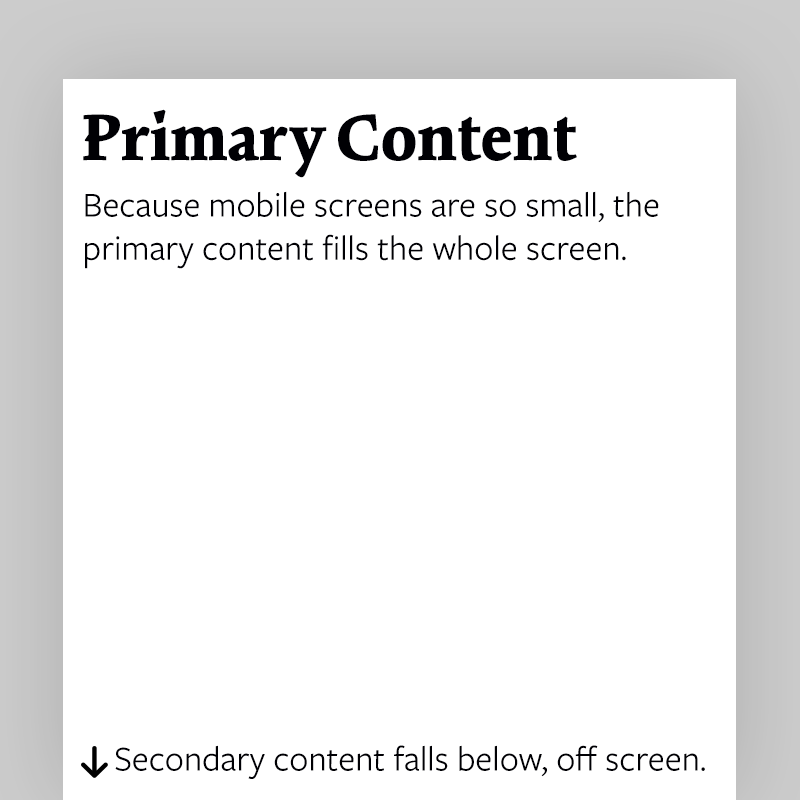
Because mobile screens are so small, the primary content fills the whole screen. Secondary content falls below, off screen.
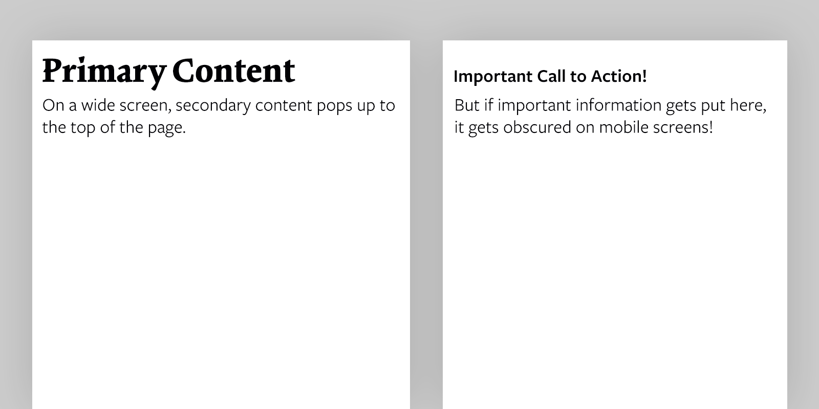
On a wide screen, secondary content pops up to the top of the page. But if content creators put important information here, it goes down to the bottom of the page on mobile screens!
Even while doubling down on small screens, I wanted to go bigger.
The Big Picture
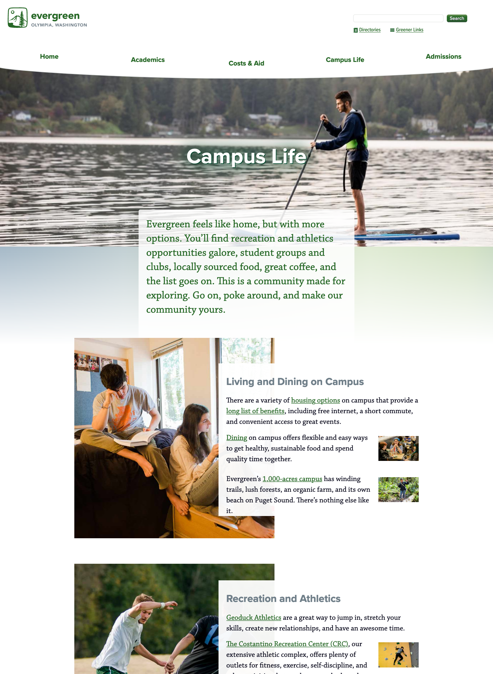
Even while doubling down on small screens, I wanted was to go bigger by taking advantage of bigger screens and high-PPI screens. While mobile proportions stayed pretty consistent with the previous design (small screens will always be small), on desktop, with its real estate actually increasing, I built in responsive layouts that take advantage of the wider screens: I broke out of the stagnant blog-column format, provided more opportunities for bigger photos, and increased the base type to previously unseen sizes. The result is that the website looked more magazine-like and felt a lot more “native” on these bigger screens.
Giving it a Good Wash
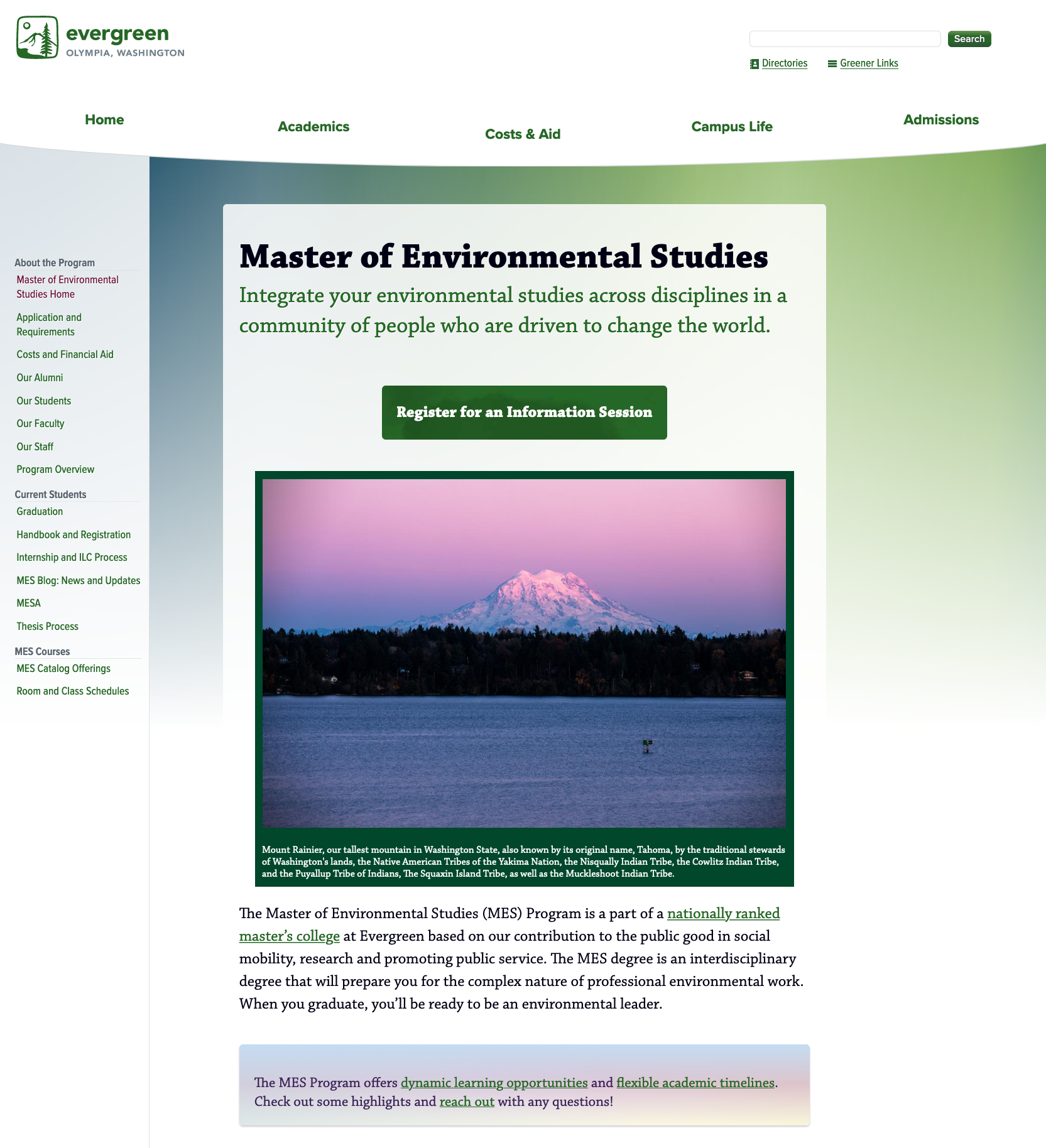
Finally, I wanted to give pages a more graphically dynamic appearance, based on new brand guidelines that leaned into a watercolor aesthetic in print and video. I implemented some raster background watercolor textures in strategic areas, but using huge images just for backgrounds quickly becomes a download burden. So, to keep the page weight low, I created dynamic “washes” using a blend of gradients and slightly transparent backgrounds. This resulted in web pages with visual interest and unity with the rest of the brand, without being overly rendered.
Overall, I’m pleased with how the site turned out, and I’m proud to have been able to provide the college with a revitalized website that will be good for the next several years.
Are you in need of design or development work? I’m available for hire! Send me an email and let’s talk.