Portfolio: Graphic Design
I’ve designed graphic elements for multiple clients both local and remote. I’ll bring a keen eye and care to your brand’s visual identity, including logos, branding, posters, and advertisements.
I’ve gathered together a few recent highlights I’ve done for some of my favorite small businesses around the country.
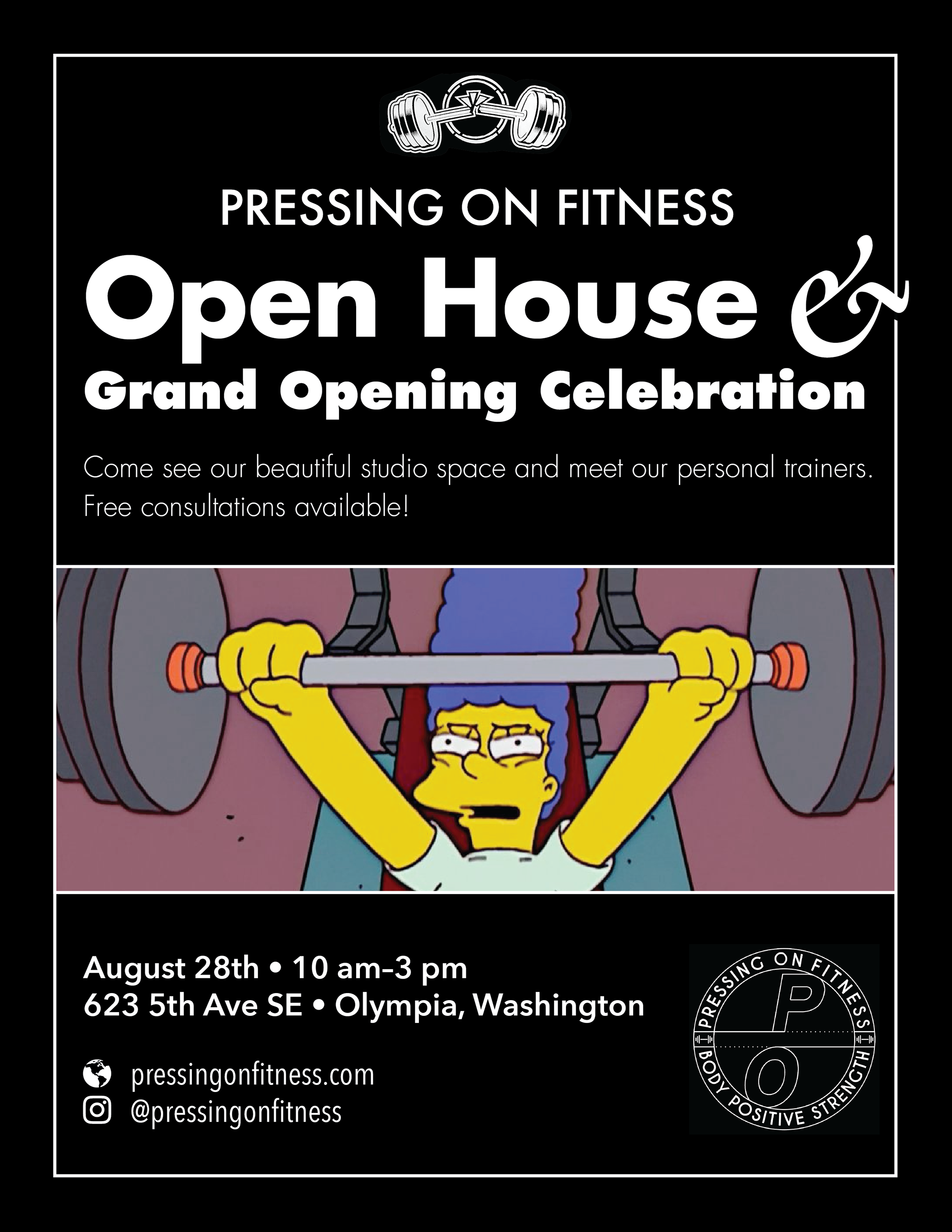
Open house event flyer.
Pressing On Fitness
Pressing On Fitness is a local, woman-owned gym specializing in personal training and fun, low-overhead events, especially for people who don’t consider themselves the typical gym-goer.
Owner Lily Richeson hired me to design some of her promotional materials, helping to solidify her brand’s fledgling identity. I also helped her out by digitizing a low-resolution scan of the gym’s iconic broken barbell graphic. I turned it into a crisp, high resolution vector graphic and provided variations that allowed her to maximize its versatility on different backgrounds in both screen and print.
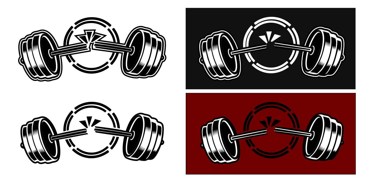
Variations on a barbell.
Epoch Builders
Epoch Builders is a team of professional builders specializing in environmentally friendly construction with a focus on integrity, sustainability, and resilience. Owner Thomas Corwin contacted me because he wanted a logo for his company.
Epoch Builders “Epic E” logo.
Justin is smart, responsive, and has great ideas. He made the process simple and straightforward.
For this client, I created the “Epic E” logo mark. The three-dimensionality visually resembles overlapping timelines (epochs) rushing forward, with the bottom one representing the new epoch of sustainability the company is building toward. The stacked nature of the blocks represents building from the ground up. And of course the E that it resembles stands for Epoch Builders.
OnMilwaukee
OnMilwaukee is a news magazine that reports on businesses and entertainment news, and hosts events in the Milwaukee area. They contacted me for help with creating banner ads for TacoFest and the Veterans Day parade.
The client provided the charming little luchador and taco illustrations for the TacoFest ad package, and I punched it up a bit by having the second one crunching into his hardshell to give it a little variation.

Online ad for Tacofest, with added crunch.
Path to Home
Path to Home is a real estate agent in the Chicago-area. Owner Adam wanted a logo to help him distinguish himself in a crowded market. As it says in the name, he wanted to focus on helping clients not just buy a house, but to find their home. I created a keyring motif that represents the winding path that home-buyers follow toward their future home. The smaller circle represents the connector between the keyring and the key itself, and it signifies the partnership that Adam has with his clients. The secondary ring also marks a point on the path symbolizing where the buyer will find their dream home.
The base “keyring” logo for Path to Home.
Are you in need of design or development work? I’m available for hire! Send me an email and let’s talk.